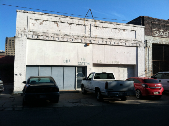
In the not-too-distant past, the first thing you would see after turning onto Cotton Street from Marshall was a sad sack-looking white building that had seen better days.
Probably the most impressive thing about it was the really fabulous stencil work.
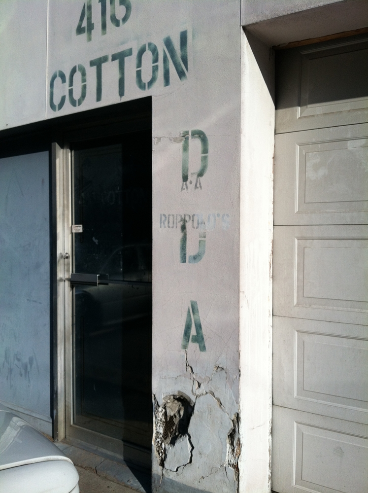
I know you’re saying to yourself “That IS impressive work. Why in the world would anyone want to change anything about this building?” Call us crazy, I guess, but even though we could find no old photos, we knew this building once looked waaay better than this and it deserved more.
Working together, the Downtown Shreveport Development Corporation (DSDC) and the Downtown Development Authority (DDA) agreed to an ‘adaptive re-use’ project. That’s basically historic preservationist language for ‘give an old building an updated use and for gosh sakes, can you make it look better, too?’ DSDC and DDA were pretty sure they could. They wanted the building to be useful and functional but also attractive and historically appropriate.
It wasn’t going to be a big job in the scheme of the Sears rehab or anything like that, but we still needed professional help. (Not of the mental variety, although with rehab that is always a possibility.) Our 6,000 SF building, in addition to looking bad, had issues. Every single thing needed updating. There was a big hole in the roof that created an indoor water feature when it rained. The original concrete floor had cracks and divots and was level only sporadically. The whole place was really, really, really, really dirty. On the positive side, we had four good walls to work with. In spite of the cracks, the concrete floor was interesting-looking. Once we could see them, we realized the rafters and beams were amazing. We assembled a go-to team of downtown architect Kevin Bryan and Daren Bailey of DBI Construction. You’ve heard horror stories about how construction projects go south and everyone ends up hating everyone else?
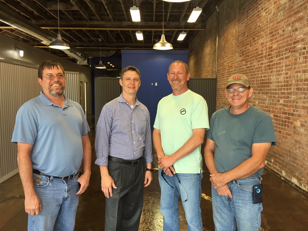
Then men in the middle. Kevin is in the slacks, Daren is the cool dude in the green shirt.
That did NOT happen here. We love those guys. They were good. They were responsive. They were concerned. They made things happen. We gave them, like, four months to draw, demo and finish the project. Seriously. We knew that they couldn’t do it in that amount of time but they gave it the old college try. It ended up taking six.
Along the way, we made some amazing finds. Remember the front of the building? Those sheets of white plywood were actually protecting something fabulous…the original transom windows.
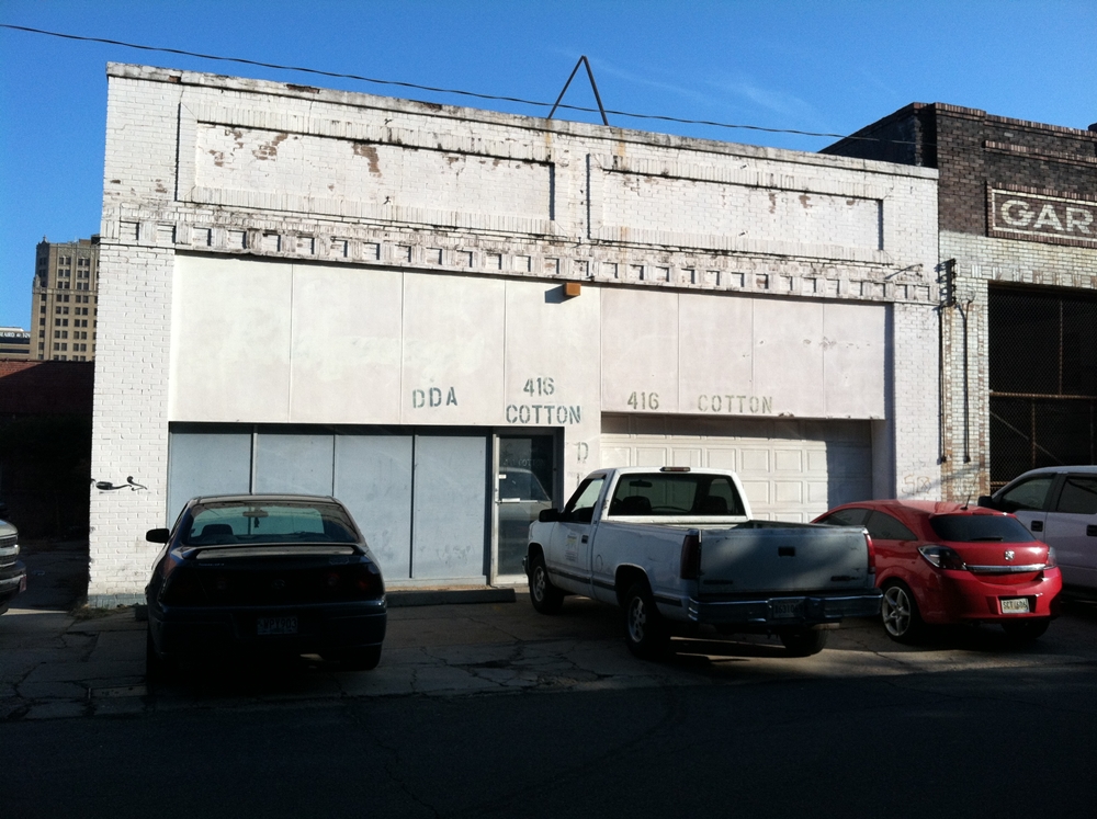
Before, with plywood.
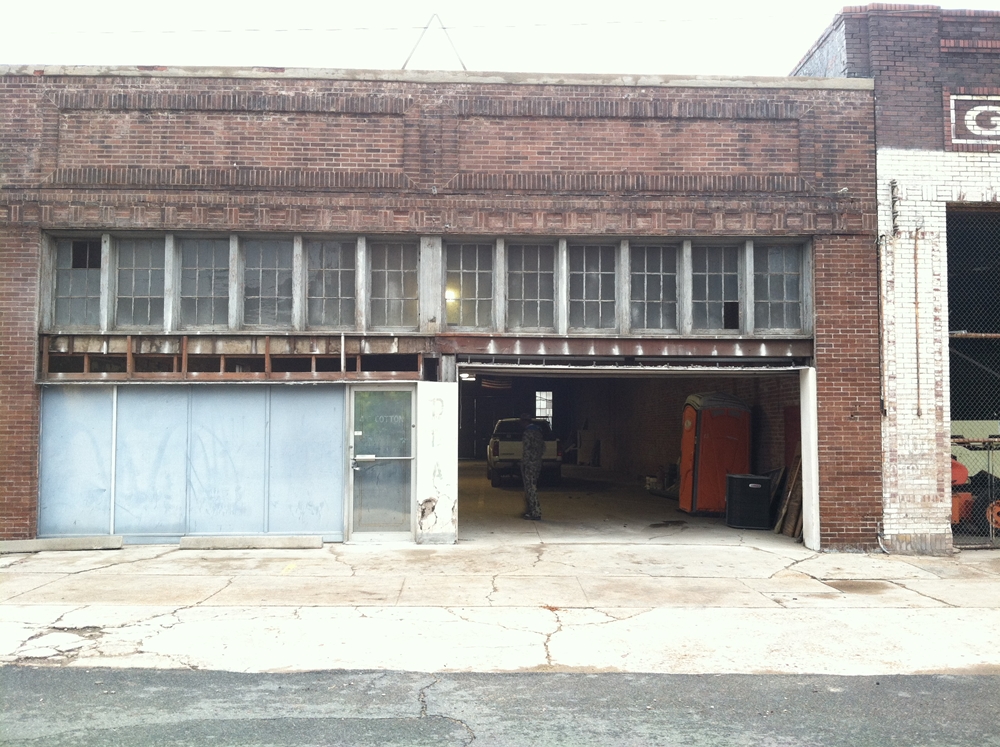
During construction, the transom windows uncovered! Be still, my beating heart.
Amazingly, when the plywood came down only a couple of panes were missing. We kept the original windows and put in storm window coverings for energy efficiency. Meanwhile, demo work was going on inside, which had been- put bluntly- whacked with the ugly stick.
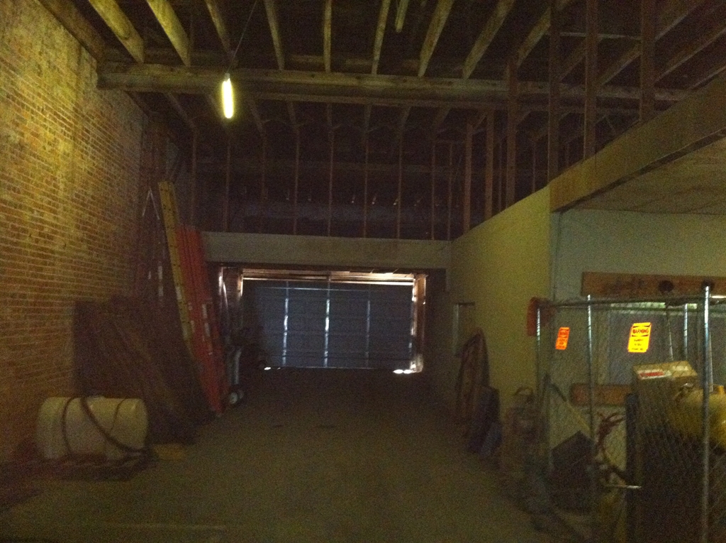
Heinous 1
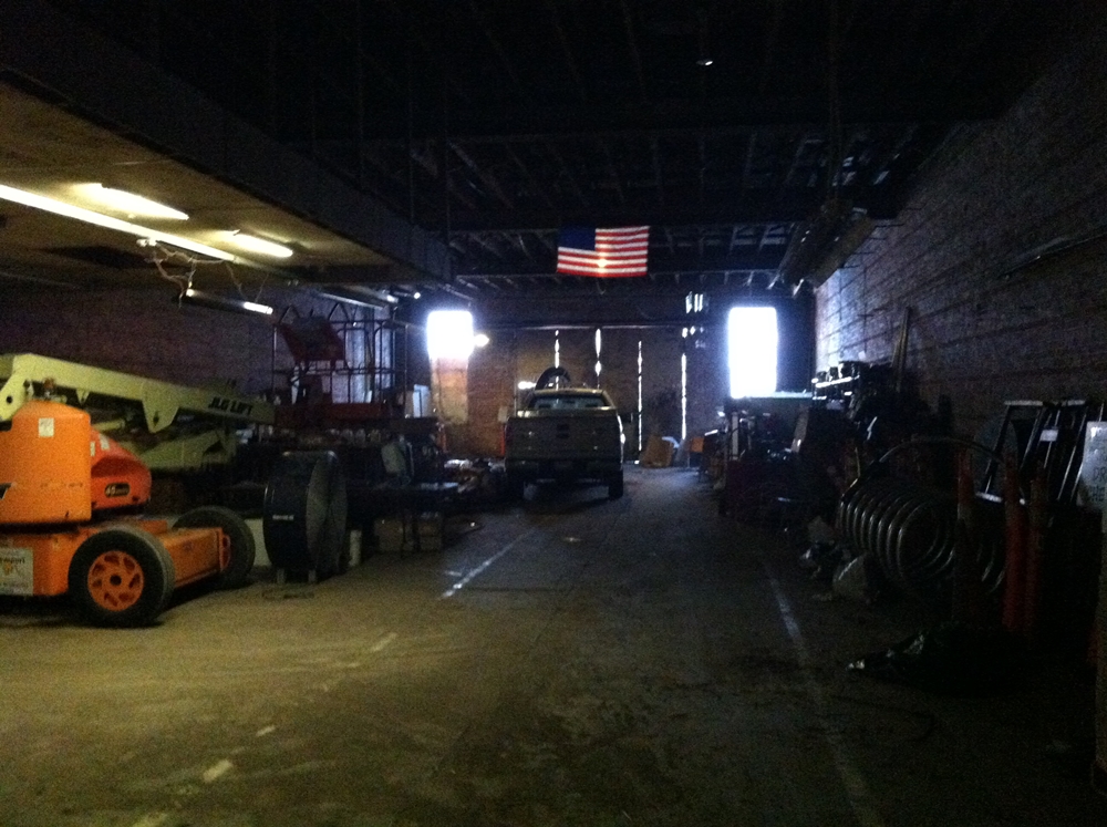
Heinous 2
The interior was so terrible that my board members questioned 1.) the wisdom of the project, 2.) my sanity, and 3.) their sanity. They voiced their concerns, set a not-to-exceed budget and let it rip. After all, they said, isn’t helping save wonderful buildings a big part of what the DDA and DSDC are all about? Those boards are awesome and I tell them that a lot.
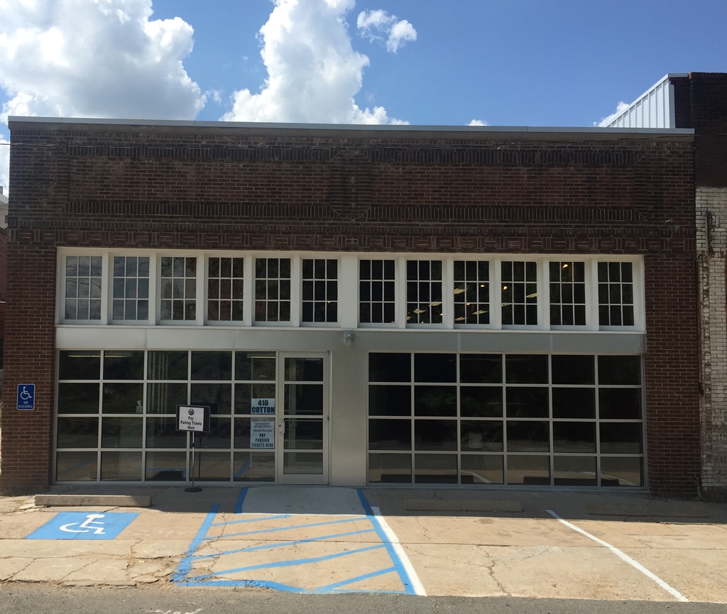
Finished Exterior! What a difference.
They were not disappointed with the outcome. As wonderful as the exterior looked, the interior was even better; fun while functional, historically-respectful with lots of modern mixed in, comfortable and really good-looking. We drew on designer Myron Griffing’s considerable talents to pull the interior look together, hired Justin Ford and Brian Carlisle for a giant reclaimed wood shelving project and some other touches of whimsy and used downtown works of photographer Molly Corbett to bring the story of our city center to life. State historic tax credits helped us bring the project in under budget as well as return a wonderful old building to life.
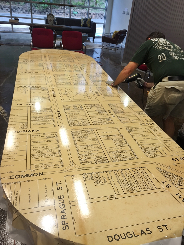
Steve Culp covers an ugly conference room table with a vinyl 1936 downtown map. We love our table now.
There’s a lot to see in our building like the cool conference tables covered in old maps, a giant finger (just you wait), a downtown version of the Arc de Triomphe and loads of art of all types from local artists. You’re invited to see it all up close and personal at our open house Monday from 4:30-7:00 pm. Greg Solomon’s re-imagined space right around the corner will be open, too. Value added!

